|
| Site Partners: | SpotterGuides | Veloce Books |
| Related Sites: | Your Link Here |
|
||||||||||
|
||||||||||
|
|
#1 | |
|
Veteran
Join Date: Apr 2006
Posts: 2,107
 |
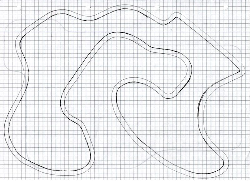
A quick sketch - please edit this
Hello MyTrackers,
this is a quick sketch that I came up with whilst doodling around at one time during the summer. It looks like a modern day Grand Prix Circuit to me, in as far as it has some interesting sections. It's meant to be between 6 and 6.5 kilometers in length. But I don't quite know what to do with this sketch, because I haven't found a space into which to fit the paddock. It's meant to run clockwise, but the place I had originally in mind for the start-finish straight, at the top right of the diagram, doesn't leave enough space in the infield for a paddock. Neither does the long bow on the lower right side of the diagram, or the straight in the middle left part that exits the infield section. And nobody would be happy to find only one obvious overtaking opportunity on a track as long as this (the originally intended pit straight). So I pass this one over to you. What would you do with it? Edits are very welcome! Thanks in advance for your input! 
|
|
|
|

|
|
|
#2 | ||
|
Veteran
Join Date: May 2008
Posts: 814
 |
At first glance, I wouldn't touch it...... not just yet.
|
||
|
|
__________________
"We had to cut speeds or else we would've ended up disappeared up our own arses!" Derek Warwick on turbos. 
|
|
|
#3 | ||
 Race Official Race OfficialVeteran
Join Date: Jul 2003
Posts: 5,779
         |
This would probably be the easiest edit, though it goes outwith the current footprint of the circuit
|
||
|
|

|
|
|
#4 | |
|
Veteran
Join Date: Apr 2008
Posts: 925
 |
6 k is a lot of track,those sweepers must be huge then! Scaled down to 66% would still make for a 4k track and that would be my only "edit"
 ,it really looks like the kind of tracks I like! ,it really looks like the kind of tracks I like!
|
|
|
|
__________________
F.I.M. Certified Race Director whowhaa!!! 
|
|
|
#5 | ||
|
Veteran
Join Date: Mar 2007
Posts: 2,306
  |
Here is myn
I chose to change the bottom bit to allow for a long pit straight and pit lane I chose to alter anything else |
||
|
|

|
|
|
#6 | ||
|
Veteran
Join Date: May 2008
Posts: 814
 |
I like SBF's edit. Gives the track more room for a better Pit&Paddock area.
I like mattt's too. A longer pit straight would be better. Both would be very enjoyable to drive. |
||
|
|
__________________
"We had to cut speeds or else we would've ended up disappeared up our own arses!" Derek Warwick on turbos. 
|
|
|
#7 | |
|
Veteran
Join Date: Apr 2006
Posts: 2,107
 |
Now these are both really pretty. Thank you mattt and ScotsBrutesFan for your input. I think I can finish the track now, when I get around to it. I guess the OtherWorld(ly) Series needs a venue in China, too, doesn't it? ;-)
Actually, I prefer mattt's location of the pitlane, because it keeps intact the Esses section on top of the diagram. But keeping the bowish loop intact also has its benefits. I'll see what I can come up with, based on your suggestions. Thanks guys. |
|
|
|

|
|
|
#8 | ||
|
Veteran
Join Date: Dec 2003
Posts: 5,892
      |
I'd be inclined to bypass that second esse by reprofiling/lengthening that long, right hand bend. This would give extra paddock space, and the extended flat-out run would provide greater scope for overtaking into the fairly acute Turn 1. Not to mention, the original arrangement gives you three rather tight corners all in succession, and it doesn't quite fit with the rest of the track.
|
||
|
|
__________________
The only certainty is that nothing is certain. 
|
|
|
#9 | ||
|
Rookie
Join Date: Oct 2008
Posts: 43
 |
The thing I like about mattt's edit is that it keeps the pitlane entrace/exit traffic well out of the way of the racing line and also makes merging happen at an area with a low speed. SBF's design (and presumably Yannick's as well) seems to create pitlane exit/race line conflicts coming into that first square left-hander.
Just my 2 cents. This is my first post, I just found this place a little while ago so I'm not an expert 
|
||
|
|

|
|
|
#10 | |
|
Veteran
Join Date: Apr 2006
Posts: 2,107
 |
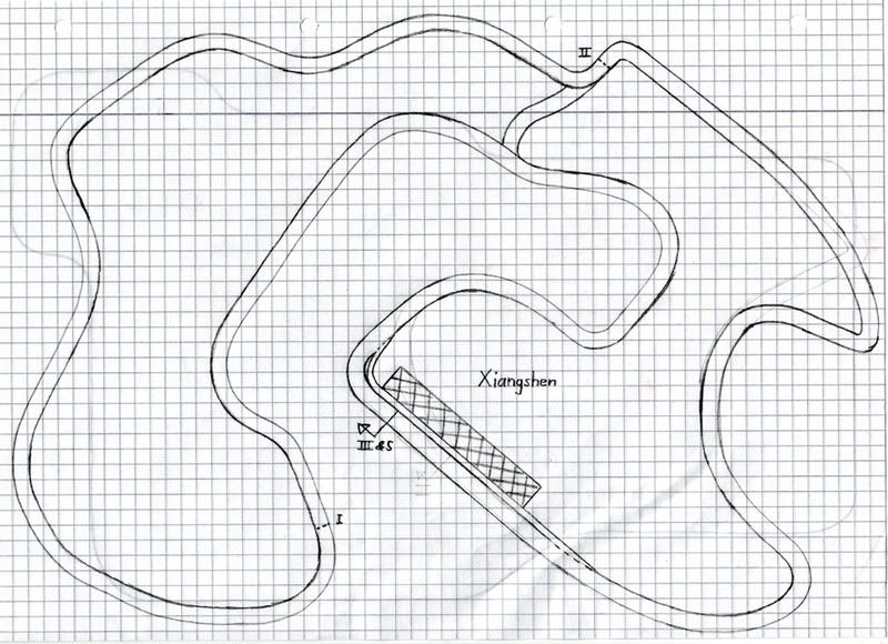
Xiangshen International Autodrome
Thanks for additional input, Purist and clarkma5. Me too, I've preferred mattt's edit, so the official credit for the following design should read "Xiangshen International Autodrome - by Yannick with inspiration from mattt" (or something along those lines)
This 6.5 kilometer long clockwise racing circuit is the home of next year's inaugural Chinese Grand Prix of the (fictional) OtherWorld(ly) Series. The facility is also welcoming motorcycle events to have a go at its GP circuit, whereas the short circuit is aimed at touring cars and F3, A1GP and other formulae. A 24 hour race for sportscars on the GP circuit is also in its planning stages. Too bad that one of the races from the already full OtherWorld(ly) calendar will have to go. Dear readers, feel free to pick one from the "Opening My Archive" thread, otherwise the series might be inclined to follow F1's example of dropping the French GP at Circuit de'l ÃŽle ;-) Here's the track diagram:  Thanks again for your edits, mattt and SBF. They have helped me to focus on what's essential to this design. |
|
|
|

|
 |
|
|
 Similar Threads
|
||||
| Thread | Thread Starter | Forum | Replies | Last Post |
| My sketch of Ayrton Senna | luke | Motorsport Art & Photography | 8 | 21 Dec 2006 21:07 |
| Well Done Sketch | The Fat Clerk | Marshals Forum | 2 | 20 Jan 2005 08:00 |
| Time to edit | woodyracing | Announcements and Feedback | 2 | 9 Aug 2001 17:34 |